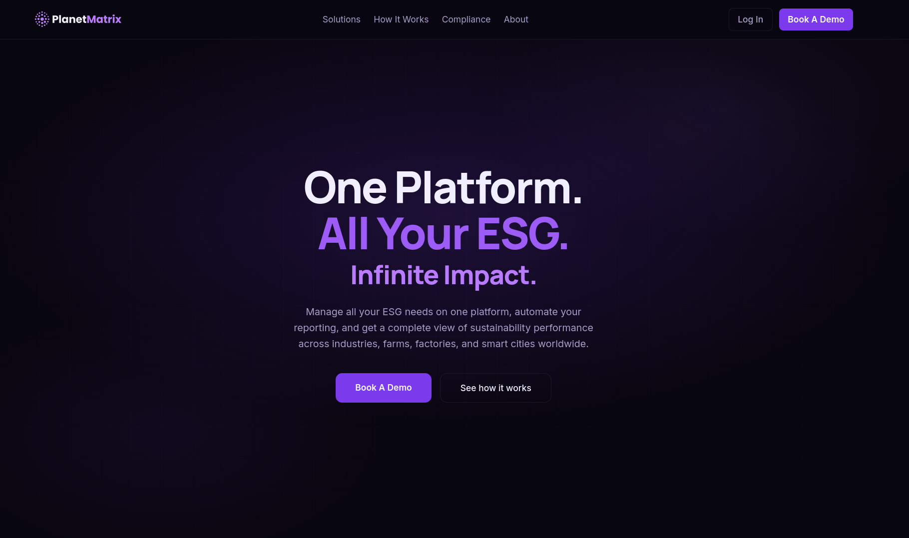
Overview
PlanetMatrix is a climate-tech startup building an ESG (Environmental, Social, Governance) platform, an AI-powered tool that helps industries, farms, and factories monitor water, energy, and carbon data and stay compliant with international sustainability frameworks. They reached out with a tight brief: they needed a credible, production-ready marketing site for the product, and a short deadline to ship it.
The catch was that there was nothing to build from. No Figma file, no brand guidelines beyond a one-page pitch document, no component library. Just a concept, a content direction, and a blank canvas. I'd be doing both the design and the engineering myself.
The Problem
ESG platforms live or die on trust. The audience (sustainability leads, compliance officers, industrial operators) needs to believe the product is serious, accurate, and audit-ready before they'll book a demo. That meant the site couldn't just look nice; it had to communicate technical credibility: real-feeling dashboards, real frameworks, a clear data-to-action narrative.
But I had no designer to hand me a polished mockup, and no pre-built dashboard screenshots that matched the dark, technical aesthetic the product needed. I had to invent the visual language and build it at the same time, under deadline.
My Role
I've built solo for clients before, but on PlanetMatrix I handled the design and the engineering together, with no handed-off mockup to work from. With no Figma file to follow, I shaped the visual direction myself, studying how existing products in the climate and ESG space present themselves so the result would feel credible to the people who already use these tools. The palette, typography, logo treatment, and layout were mine to decide, along with the code behind them. If a section didn't feel trustworthy, there was no one to blame and no one to fix it but me.
What I Built
- A full single-page marketing site with fixed navigation, an animated hero, and smooth-scroll sections
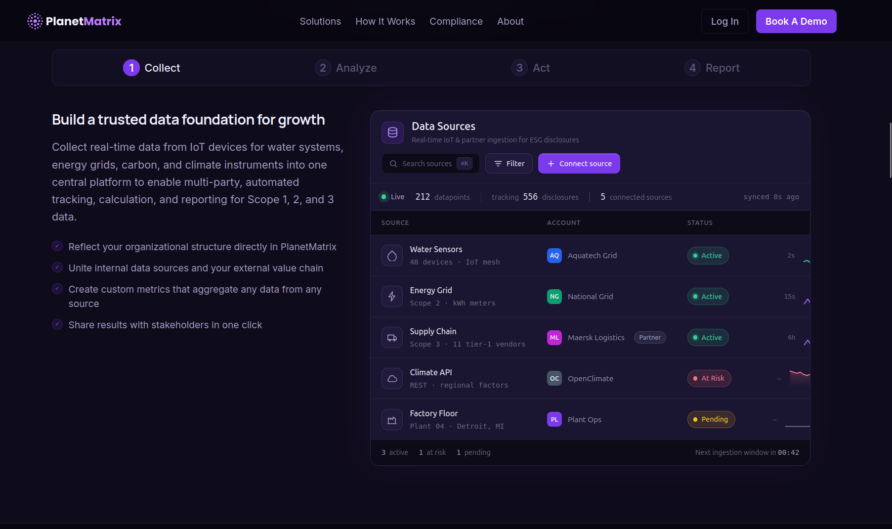
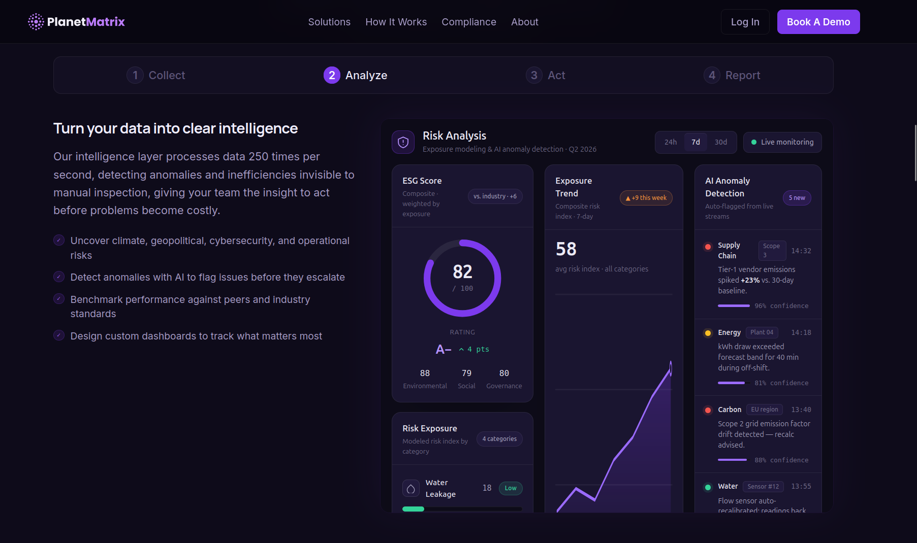
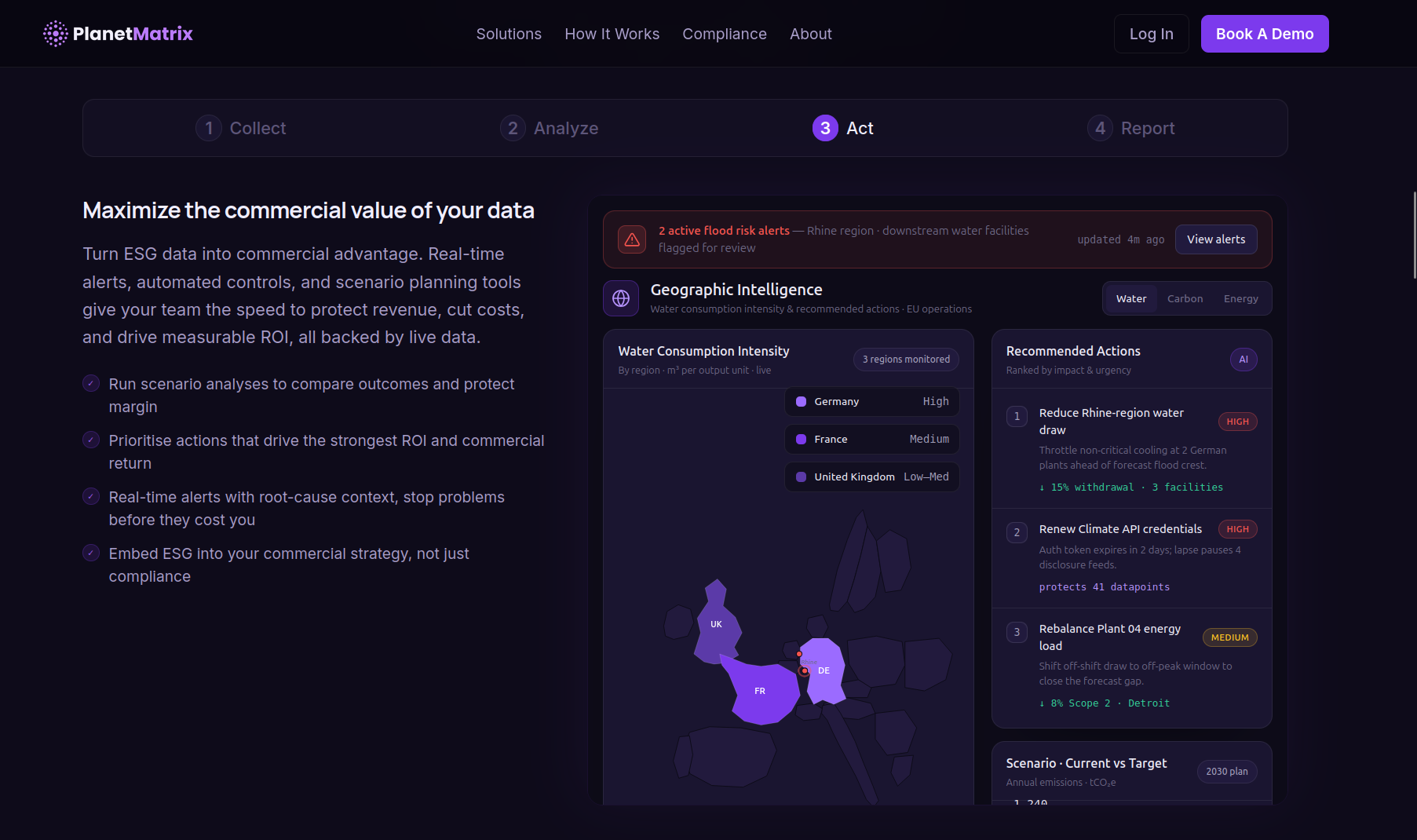
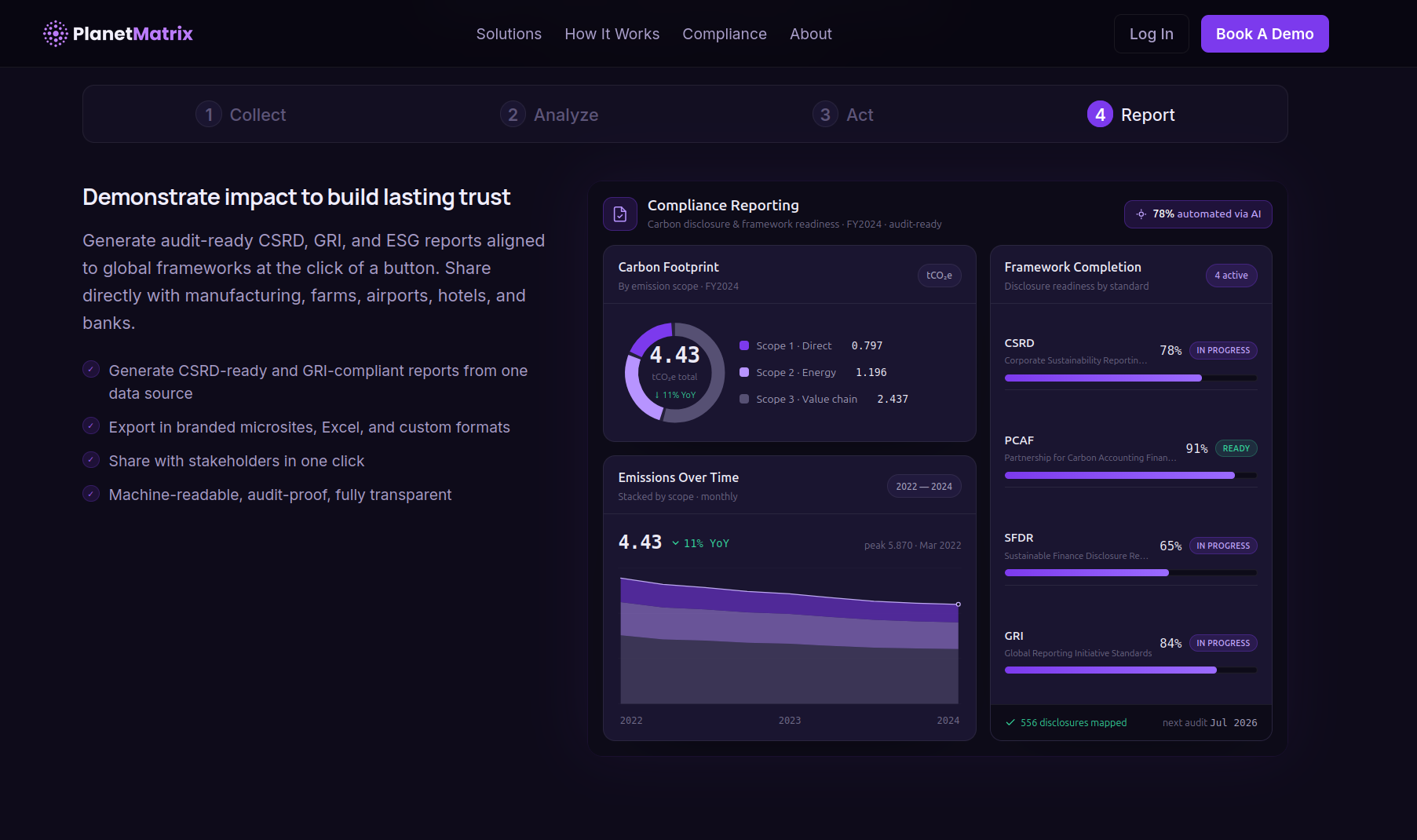
- An interactive “How It Works” section with four tabbed panels (Collect → Analyze → Act → Report), each with its own custom dashboard visualization
- Four custom dark-themed dashboards: a live data-source table, an AI risk-analysis panel, a geographic intelligence map, and a compliance reporting view
- A capabilities grid, a three-step compliance journey, a frameworks section, and an impact-pillars layout
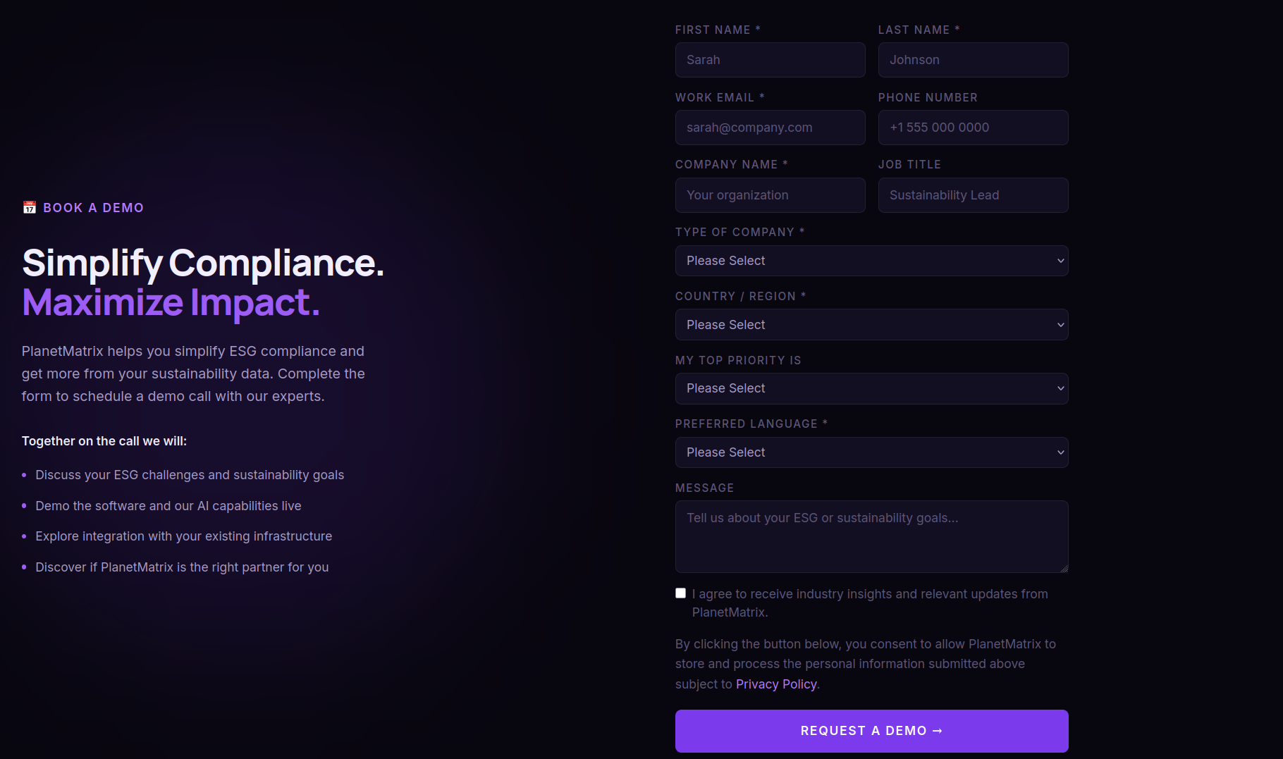
- A fully functional “Book a Demo” form wired to a real email-delivery backend
- A complete deployment pipeline: custom domain, DNS, and transactional email
The Dashboards
The dashboards were the heart of the site, and the most time-consuming piece. Generic placeholder charts looked fake, so instead of decoration I designed four screens that actually reflect the product's domain, one for each step of the “How It Works” flow. They're visualizations built into the landing page itself rather than a live app (a preview of what the actual product will do), but the goal was for them to read as the real thing.
The Hard Parts
Designing without a designer. I leaned on AI design tooling to explore directions fast, then refined the output into a coherent system: a deep-purple-on-near-black palette, a custom dotted-globe logo mark, and a consistent card language. The dashboards were where this mattered most: each one had to map to a real slice of the domain, like water-leakage risk, scope emissions, and framework-completion percentages.
Email that actually sends. The “Book a Demo” form needed to deliver real emails from a branded domain. I set up Resend for transactional email, verified the domain via DNS records, and built a Next.js API route to handle submissions. The recurring gotcha: environment variables only take effect on new deployments, so the form kept failing in production until I learned to always redeploy after touching secrets, and to read the API's JSON error response instead of guessing.
Deployment & DNS. Connecting a custom domain meant coordinating between a domain registrar and the hosting platform: A records, CNAMEs, verification TXT records, and the occasional propagation wait. I also had to migrate the whole project between hosting accounts cleanly, re-pointing the domain without downtime.
Tech Stack
- Next.js & TypeScript: App Router, API routes, server-rendered marketing pages
- Tailwind CSS v4: utility-first styling with custom CSS-variable design tokens
- Resend: transactional email delivery from a verified domain
- Vercel: hosting, environment management, and deployment pipeline
What I Learned
The biggest shift was realizing how much design is engineering when you're solo. I couldn't hide behind “the mockup said so.” Every spacing choice, every contrast decision, every “does this dashboard look real enough to trust” judgment was mine to own. It made me a more deliberate developer.
I also learned that the unglamorous infrastructure work (DNS records, env vars, redeploys, domain verification) is where projects actually get stuck. Writing the UI was the fun part; getting email to send reliably from a custom domain in production taught me more about how the web actually fits together than any component ever did.